
Plateful app development
and design.
This UX/UI team project was done in groups of three, it involved researching and developing a concept for an app in addition to designing what that would look like.


During the research phase of this project, we developed a persona for an ideal user of our app. We then mapped out this persona’s journey through existing apps and then plotted it through our new app. This journey includes interaction touchpoints and opportunities to be of assistance, both of which will attract users.


Character: Van
The prankster of the group. Plays drums in a rock band.

This style tile demonstrates the typography, color palette and additional design elements we used. A primary focus was readability. The typeface is Quicksand, which comes in various weights, and is scalable and ideal for digital display. We selected a monochromatic color palette that conveys freshness.
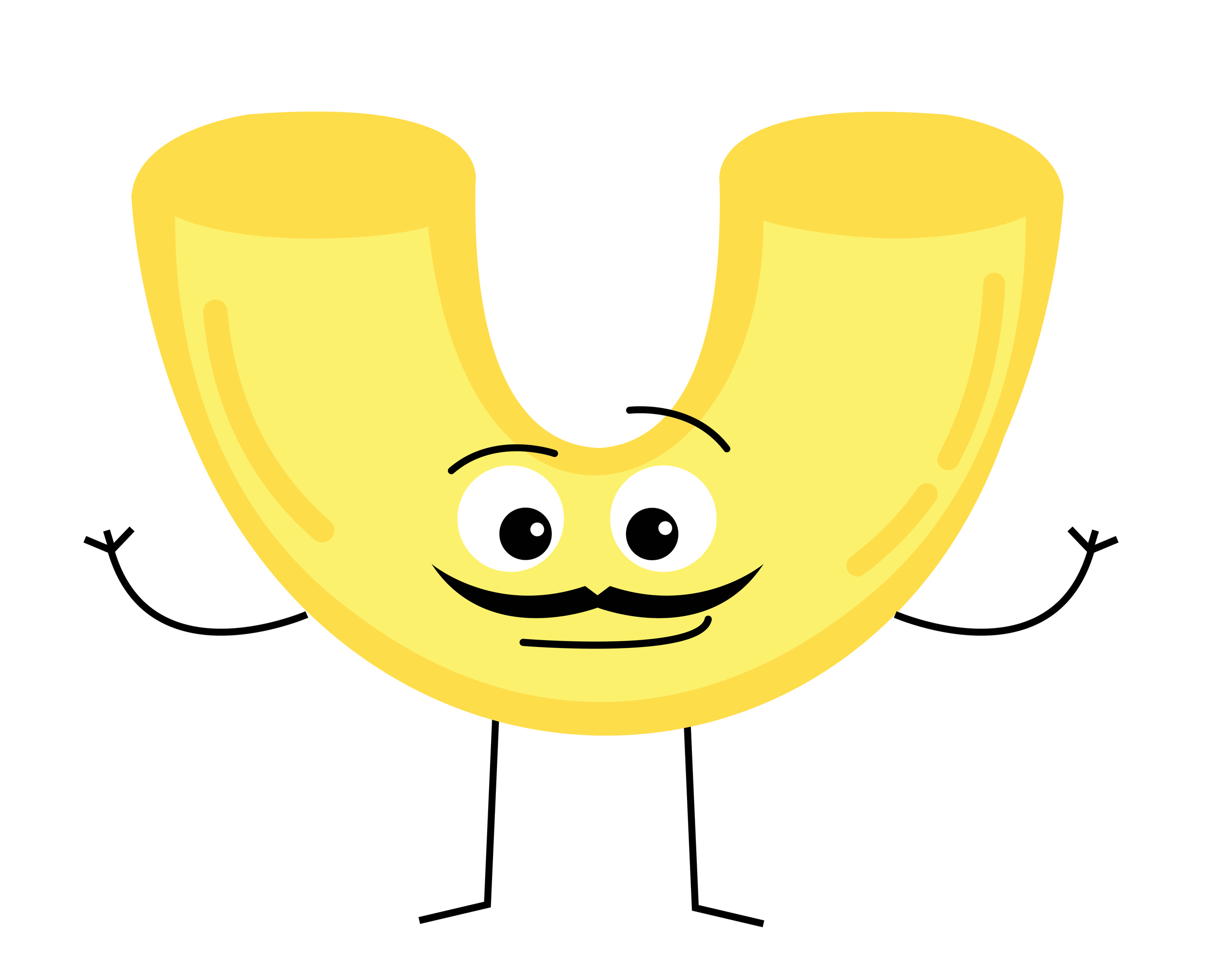
Character: Mateo
A true Italian that can be found at the skate park.


Character: Rita
The most charismatic carrot you’ll ever meet and never passes on a game of chess.

We created wireframes in Figma that demonstrate how the various screens in our app would appear.

Character: Brenda
This red ball of fury packs a punch. Brenda knows what she wants and is a real go-getter.
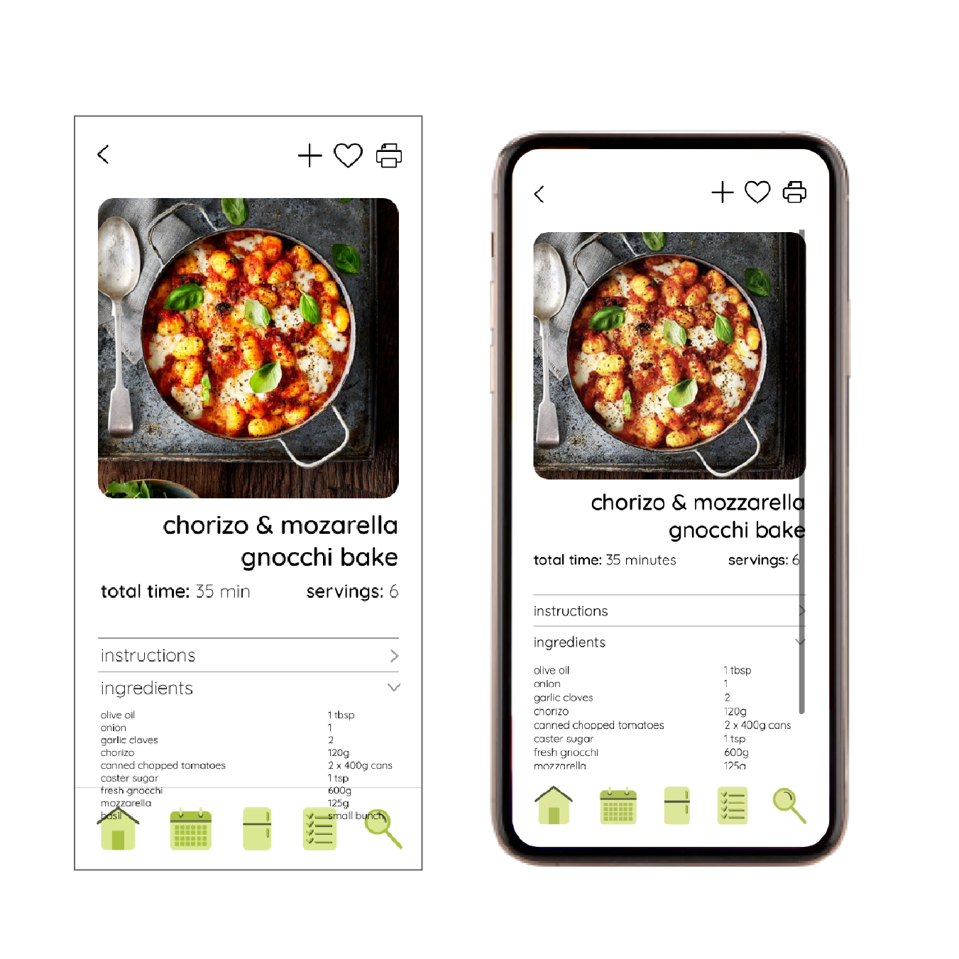
Once we had our wireframes developed in Figma, we used Atom to build a more realistic prototype using HTML.

Character: Fred
This guy has been in a constant state of shock after his shell broke.
This is an interactive prototype that allows you to click through our wireframes!