Creating a Symbol System for Franklin Park Conservatory.
For this project I was tasked with designing a symbol system for Franklin Park Conservatory. This would have the purpose of being used in applications for an upcoming spring exhibit.
To the left are elements from Franklin Park’s current brand style guide. The brand look is natural, bright and fresh. They use the typography and colors in mobile and environmental design applications. The Conservatory utilizes the pictured icons to represent different categories for the upcoming happenings on the calendar.
For the symbol system I selected eight different flowers to represent, a combination of annuals, biennials and perennials. I started by hand sketching them in a more illustrative style and then went over them in ink.
These are the black and white and color versions of the symbols I created. I was challenged to avoid unnecessary detail but still retain the essential components unique to each flower. The stroke weights and style are consistent throughout.
I then took one of my symbols, the Begonia flower, and created a tile pattern that could be used for a gift bag application. I did one version using brand colors and then experimented with additional color schemes.
To create the pattern, I placed the individual symbol in a pattern cell and oriented it in four different positions on a grid. I then applied different color palettes and decided to use the tertiary scheme shown in the bottom right for my final design.
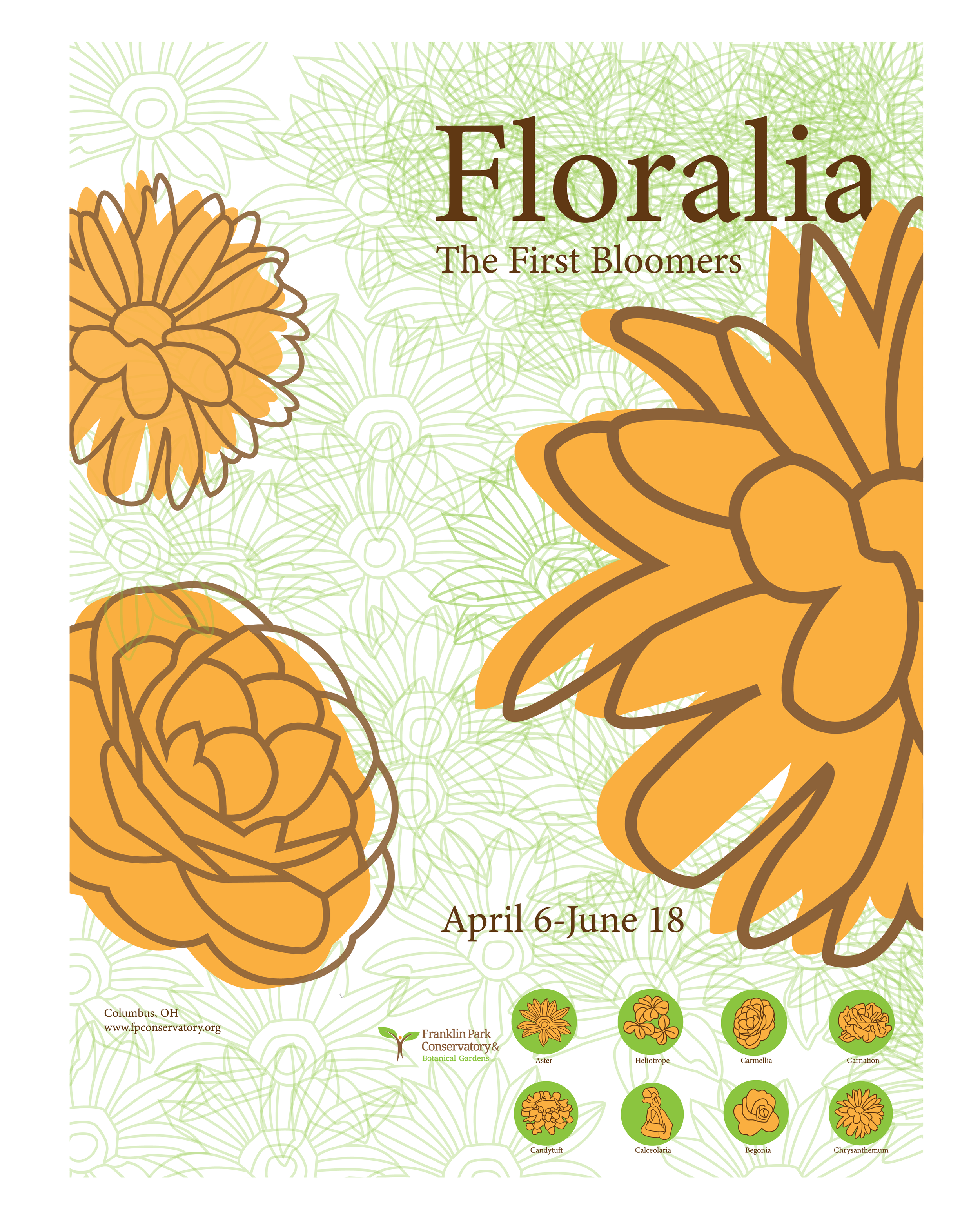
These are the final deliverables for this project: a promotional poster and gift bag. The poster uses the color and typeface from the brand style guide (Droid Serif) and an Aster symbol pattern I created for the background. The bag uses some brighter colors for an eye-catching souvenir.


